Editing Skins
 Outputs Supported

After you add a skin to your project, you can open it and edit its settings. Also, if you create a project, Flare Online may provide an initial skin that you can edit (depending on the template selected).
[Menu Proxy — Headings — Online — Depth3 ]
Permission Required?
Editing content and project files is an activity available to users with the Author status. By default, users with Author status have the following permissions set:
-

If this is deselected, then viewing files in a read-only mode is allowed. On the left side of the page, the Files vertical three-dot menu is not available.
-

If this is deselected, the XHTML in the Code view is read-only.
Editing code is regarded as a capability for an advanced user. If not done properly, the code can become malformed quickly. Administrators can prevent users from editing the code by deselecting the Edit Code permission.
For more information about permissions, see Setting User Permissions or Setting Team Permissions.
How to Edit a Skin
The skin settings help determine the look and feel of your output when you build a target.
-
From the Project files in the workspace, expand the Skins folder, and click the skin you want to open.
-
From the editor's left pane, select a skin style. There are various skin styles for the different skin types, but the following are the main settings to edit.
Style Group
Description
Global
Use to specify navigation pane settings and control the main page padding and size. You can choose the main menu position, the slide-out menu position and style, fixed header, depth level of menu items (Top Navigation only), and a logo URL (i.e., topic or URL linking to the logo).
When you update the Global group, you can ignore the preview and medium styles that display to the right. The Global settings apply to the entire skin.
Header
Use to edit the top area of the screen. The header displays elements such as a logo, search bar, and a Flare Online account link (if you are producing private output).
Navigation (Menu)
Customize the menu that typically displays to the left or right of topics (i.e., Side Navigation), or the menu that displays at the top of topics (i.e., Top Navigation). Specify settings for the entire menu or for individual items and actions at different levels. The menu levels correspond to the items in your TOC file.
Search Results
Control the look of search result elements such as the heading, suggestion, abstract (i.e., descriptive text of the file), link, path, glossary, pagination, featured snippets, and knowledge panel.
-
Edit the desired property. (When a style group is expanded, more sub-styles are revealed to edit—and subsequently the style's relevant properties.)
Example You have a project about Austin, Texas. After looking at the project's Side Navigation output, you decide to edit the skin to change the white menu items to display in orange.
From the Style group Side Navigation, you expand it to click Menu > Item. In the corresponding properties section, you expand Font.
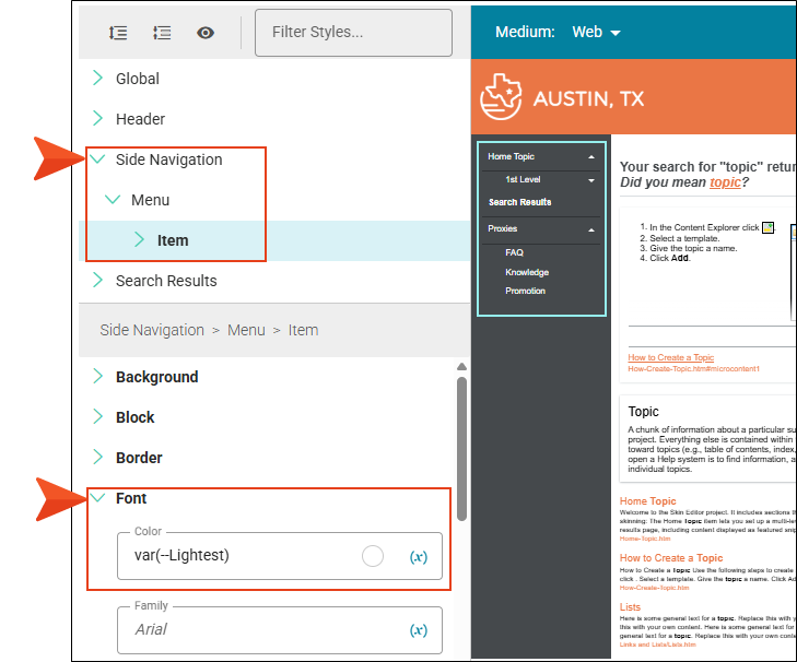
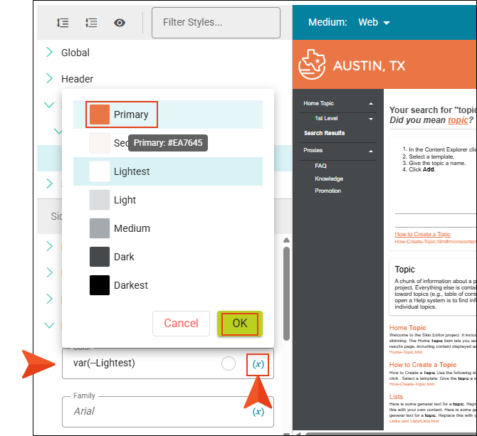
There are several ways to change the color, but since you want to match the branding, in the Color field you click the Insert Variable icon, select the Primary branding color, and click OK.
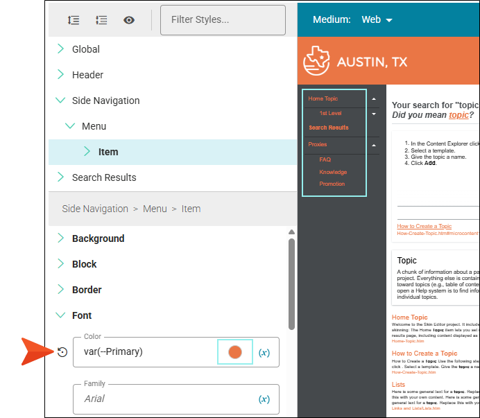
You preview the changed menu items.
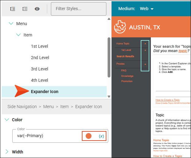
To polish the look, you do the same for the expander icons.
-
Click Commit.
-
In the Create New Commit dialog, verify the new file path, and enter a Commit Message.
-
Click Commit. (Or click Cancel, to back out of the process.)
Tip Use the preview in the editor to help you find the style you need to change. Click Highlight in the local toolbar and click in the preview area to the right. The corresponding style is selected on the left side of the Skin Editor.
For more about skin styles and properties, see the Flare Desktop Help system.
Global Navigation Pane Properties
Following is a list of global navigation pane properties.
Main Menu Position
Choose where you want the main links to be located in the skin—Top, Left, or Right. This is the primary menu (links to topics) that is based on your TOC when the output is viewed on a large screen (not tablet or mobile). If you select “Top,” you will be creating Top Navigation output. If you select “Left” or “Right,” you will be using Side Navigation output. You can also set this option to "None," which is common if you want skinless output.
Slide-Out Position
Select a location (Left, Right, None) in the output window for the navigation pane. For Side and Top Navigation, this refers to the flyout that appears when responsive output is activated and the screen is too small to show the regular menu.
Slide-Out Menu Style
Choose the look of the slide-out menu for Side or Top Navigation output (i.e., the menu that opens when you click the “hamburger” icon in tablet or mobile view). Either a drilldown or a tree format can be selected.
Fixed Header
With Side or Top Navigation output, you can fix the header portion of the topic so that it stays in place when users scroll down to see more content. For Top Navigation, you can do this for web, tablet, or mobile screens (or all of them). For Side Navigation, you can do this for web screens (or all—web, tablet, mobile).
Top Menu Levels To Show (Depth)
Specify how many levels of your TOC items are included in the top menu navigation. The default is 3. (This option is available only for Top Navigation when the Main Menu Position is set to Top.)
Logo URL
Select a topic to be linked to the logo. By default, the logo is linked to the Home (i.e., startup) topic. You can select a different topic or enter the URL to your company's website instead.
Style Properties for Skins
Following is a general list of style properties in alphabetical order.
Note Several properties below allow you to edit the units of measurement (e.g., pixels, points, centimeters).
Absolute Position
For certain styles, this can allow you to be more precise with the position of an element. This might be necessary to prevent the element from disappearing from the screen. In addition to entering values with specific units of measurement (e.g., pixels), you can enter auto in a field. You might do this, for example, if you want the left or right property to have a particular value, but leave the other property to be adjusted automatically.
Alignment
Depending on the style and element you are working with, you may be able to select one or more of the following:
- Horizontal This option lets you choose whether to position the element to the left, middle, or right.
- Vertical This option lets you choose whether to position the element on the top, middle, or bottom.
- Full Row This option allows the element to take up all of the space horizontally in the header.
- Order This option determines which element comes first (1), second (2), third (3), or fourth (4) in the header. Side Navigation has three elements (logo, search bar, and Flare Online account link), but Top Navigation has four (logo, search bar, menu, and Flare Online account link).
Background
You can change any of the following for the background:
-
Gradient This lets you change the background color using a progression effect. Select the beginning gradient color in the first field, and then select a second gradient color in the second field. You can use any of the following to enter or select a color.
-
Color Select a single color. You can also insert an existing CSS variable as a color.
-
Image Select, upload, or insert a variable for an image background. The Image field has the highest precedence, which means that if you enter settings in all of the Background fields, the image will win.
-
Repeat Specify if the image should repeat or not.
Block
This is the container (or "block") holding content in an element. Adjust the line height in length and unit (e.g., pixels, points, centimeters), text align (e.g., center, justify, left, right), text indent, and word wrap option to affect the block.
Border
Use the Border properties to modify the border edges (e.g., left, right, top, bottom). For example, you can add a border line around the edges of an element, and customize the type, size, and color of the border line. The last three fields are alternative ways to choose a color for the border.
You can also adjust the border radius for rounded corners by selecting length and unit (e.g., pixels, points, centimeters). The higher the number, the more of a curve the corner will have.
box shadow
This is the box shadow effect on the element.
- Horizontal Shadow Length This is the position of the horizontal shadow. Negative values are allowed. In the first field type a number or use the arrows. In the second field select the unit (e.g., pixels, points, centimeters).
- Vertical Shadow Length This is the position of the vertical shadow. Negative values are allowed. In the first field type a number or use the arrows. In the second field select the unit (e.g., pixels, points, centimeters).
- Shadow Blur Length This is the blur distance. In the first field type a number or use the arrows. In the second field select the unit of measurement.
- Shadow Color Select a color for the shadow. You can also insert an existing CSS variable as a color.
- Shadow Inset This changes the shadow from an outer shadow (outset) to an inner shadow. Select from the drop-down false (i.e., outset), or true (i.e., inset).
color
Select a single color. You can type a hexadecimal number (e.g., #000000) in the field, select from a Color Picker, or insert an existing CSS variable as a color.
font
You can change any of the following for the font:
- Color Select a single color. You can also insert an existing CSS variable as a color.
- Family Select or type a specific font family (e.g., Arial, Tahoma, Verdana). You can also insert an existing CSS variable.
- Size You can change the font size. In the first field type a number or use the arrows. In the second field select the unit (e.g., pixels, points).
- Weight From the drop-down select to make the font normal or bold.
- Style From the drop-down select to make the font normal or italic.
height
You enter a height for the element. In the first field type a number or use the arrows. Then click in the second field and select the unit of measurement (e.g., pixels, points, centimeters).
layout
Specify how you want the element to display. From the drop-down, select none (the element will not be shown), or block (the element will be shown).
margin
You can change the margin for any of the sides on the element (Left, Right, Top, Bottom). In the first field type a number or use the arrows. Then click in the second field and select the unit of measurement (e.g., pixels, points, centimeters).
padding
You can change the padding for any of the sides on the element (Left, Right, Top, Bottom). In the first field type a number or use the arrows. Then click in the second field and select the unit of measurement (e.g., pixels, points, centimeters).
size
Change the maximum length of the element. (Depending on the property this could refer to height or width.) In the first field type a number or use the arrows. In the second field select the unit of measurement (e.g., pixels, points, centimeters).
text decoration
Use to set the appearance of decorative lines on text. From the Text Decoration drop-down select underline, overline, line-through, inherit, or none.
width
You enter a width for the element. In the first field type a number or use the arrows. In the second field select the unit of measurement (e.g., pixels, points, centimeters).
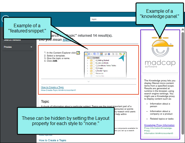
Note By default the Side and Top Navigation skins include style groups for featured snippets and knowledge panels. These items are not supported in Flare Online, but they are honored from Flare Desktop projects and you can do minor skin editing on them.
To help identify these features (i.e., micro content) in the preview or output, the featured snippets display in HTML5 output above the regular search results, and the knowledge panel typically displays on the right side of the search results page.
What’s Noteworthy?
Note If you are using branding in your project, you might see those elements in the skin. For example, if a CSS variable is defined in the Branding.css file, the variable might display in a Skin Editor field when you select a color or an image (since it points to the branding file).
Note Notice that you can modify the look of the search bar, Flare Online account link, menu, and glossary that might be included with the Side or Top Navigation skin. Be aware that you can also insert a proxy for these components in a template page or in a topic. For example, you could place another menu in a topic in a different position. You can use the Skin Editor to edit the overall look of the new menu.
Note If you originally set skins using Flare Desktop and are currently using Flare Online, you might notice some skin options from Flare Desktop are hidden (e.g., micro content, topic proxies, UI text, TOC) and some show but do not pertain to Flare Online (e.g., featured snippets, knowledge panel).
Rest assured that all your original settings are still honored from the desktop. It is just that Flare Online does not support editing them in the editor. If you are an advanced user, you can edit all skin options in Code view.
What’s Next?
After you have finished editing skin settings, you need to make sure the skin is associated with a target that you want to build.