Skin Editor
In the Skin Editor, you can update common skin properties that are found in the header, navigation menu, or search results using a simple Styles tree. An interactive Preview allows you to sample the experience you are creating for your users.
The Skin Editor opens in the easy-to-use Content view in the workspace. This capability offers a faster path in the cloud, rather than relying on Flare Desktop, to make routine edits and to refine the end-user experience for online output. (If you are an advanced user, you can edit all skin options in Code view.)
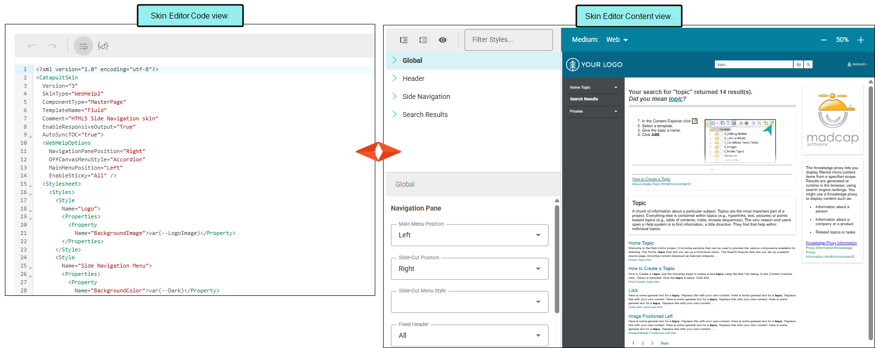
[Menu Proxy — Headings — Online — Depth3 ]
Skin Editor Features
Regardless of the skin type, the editor displays with the following parts: styles tree, preview, highlight, mediums.
-
Styles Tree When you open the Skin Editor, the left pane features a top section with available style groups, and a bottom section with corresponding properties. The sections mimic a tree structure with root and child nodes. By default, the items are truncated to the root node, but can be expanded by selecting the expand/collapse icons next to them. To find a style group quickly, use Filter Styles, or select a style group to pinpoint a property to edit.
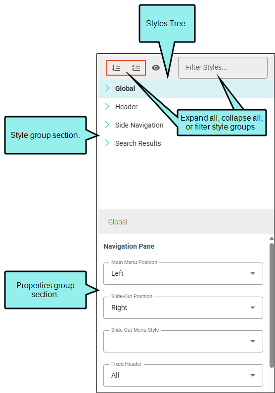
You can specify main navigation pane settings (e.g., position, slide-out, fixed header). Other nodes let you specify settings for the header area, the navigation menu, and search results. The sections are dynamic (i.e., displayed or hidden) based on what is applicable to the selected skin, setup options, and style.
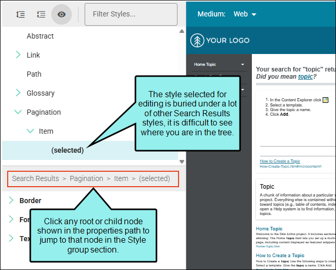
Tip Use the Properties group header to quickly navigate back up the Style group tree.
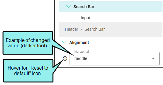
Note When making edits in the Skin Editor, notice that some fields display text or numbers in gray. This is the default value for that particular field.
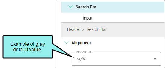
If you enter a different value, the font displays darker.
-
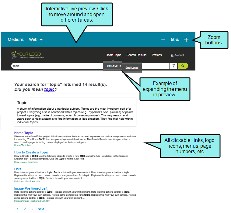
Preview As you select options from the styles tree, notice the settings are reflected in the live preview (i.e., the right side of the editor). The editor is more than just a static image, click in the preview to move around and open different areas. Use the zoom buttons to increase or decrease the viewing perspective in the preview itself.
-
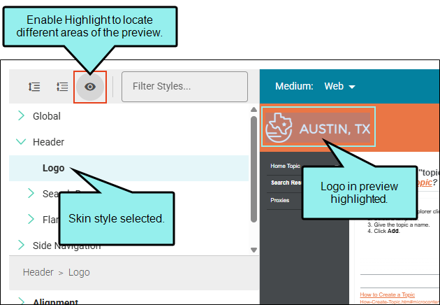
Highlight From the local toolbar, click Highlight. The mode changes where different areas of the preview become highlighted as you move the mouse over them. If you click an element in the preview, Flare Online selects the corresponding style on the left and vice versa, making it easier to identify which skin style controls that element.
-
Mediums HTML5 skins support responsive output and come equipped with three mediums—Web, Tablet, and Mobile. You can use these mediums to specify different looks when necessary for the different devices people might be using to view the output. By default the setting is Web, which means that users will see the output like it displays in a regular browser.
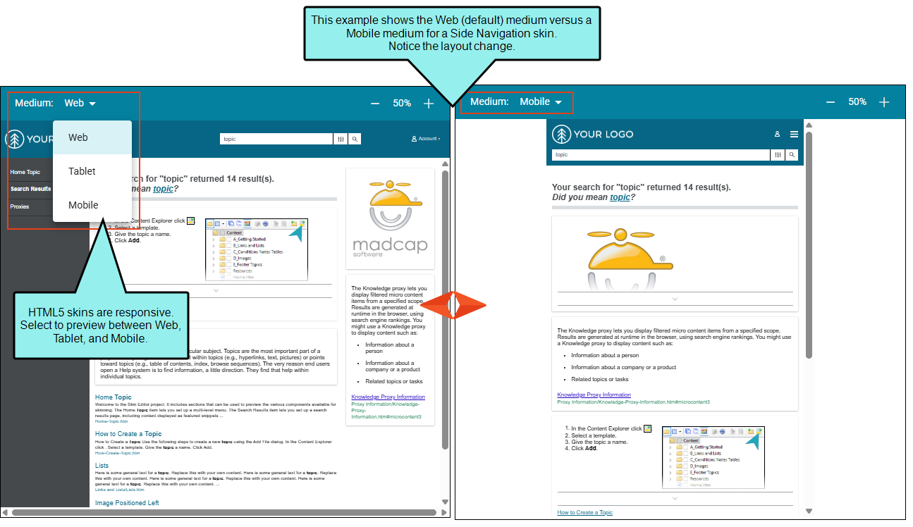
Note Similar to cascading stylesheets (CSS), there is a system of inheritance at work with skin mediums. The Web medium is the default. Most settings in that medium are inherited by the Tablet medium. In turn, settings in the Tablet medium are inherited by the Mobile medium.
What’s Noteworthy?
Note If you originally set skins using Flare Desktop and are currently using Flare Online, you might notice some skin options from Flare Desktop are hidden (e.g., micro content, topic proxies, UI text, TOC) and some show but do not pertain to Flare Online (e.g., featured snippets, knowledge panel).
Rest assured that all your original settings are still honored from the desktop. It is just that Flare Online does not support editing them in the editor. If you are an advanced user, you can edit all skin options in Code view.