Adding Widgets to a Dashboard
After you’ve added content and information (e.g., projects, tasks) to your license, you will probably want to add widgets to your Home and Project dashboards. For example, on your Home dashboard you might want to see widgets showing storage and usage, project bookmarks, reports, build activity, and a task calendar. And on your project dashboards, you might want to see widgets showing project properties, live builds, checklists, and target build history.
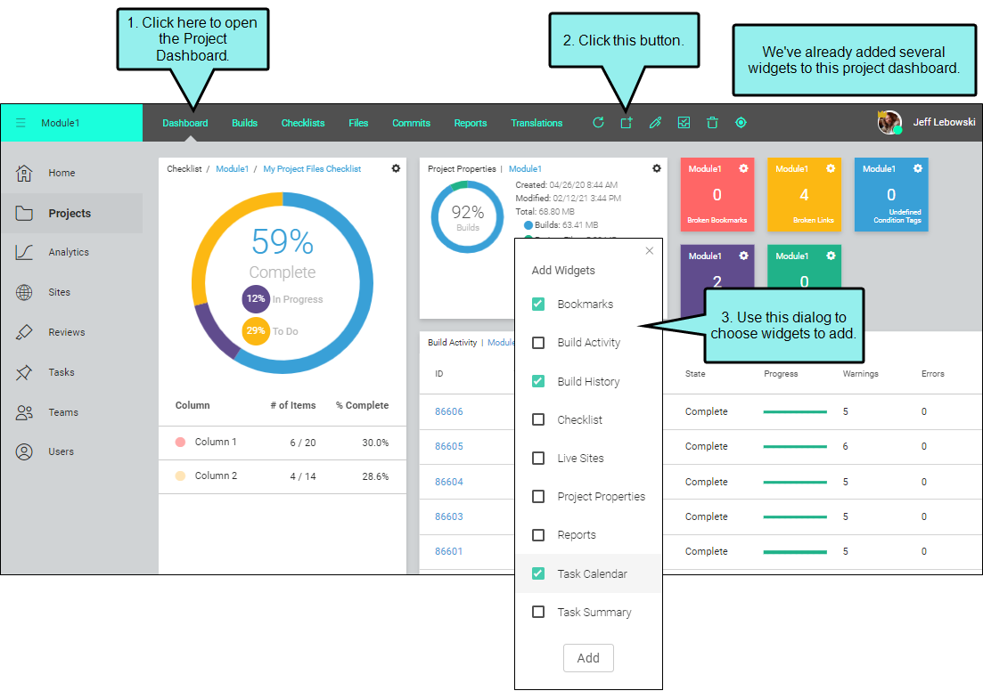
How to Add a Widget to a Dashboard
-
Do one of the following, depending on the part of the user interface you are using:
- Home Page On the left side of the interface, click Home.
- Project Dashboard On the left side of the interface, click Projects. Click a project name. The Project dashboard opens.
- In the toolbar click
 .
. -
Select the widget(s) you want to add to the dashboard.
Bookmarks
The Bookmarks widget lets you quickly jump to the dashboard for your favorite projects. In the upper-right corner, click
 to select projects.
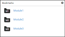
Note Data will not display in this widget until you select projects.
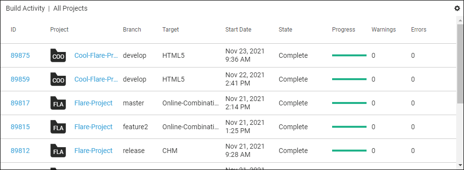
Build Activity
The Build Activity widget lets you see all of the builds that are in various states (e.g., failed, completed, canceled, queued). The most recent build appears at the top of the widget.
In the upper-right corner, click
to filter the widget for a single project, as well as for particular states. The 10 most recent builds are displayed by default, but you can change this setting from the menu.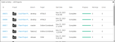
In this widget, you can view the following:
- [Icon] Click the project icon to open a dialog where you can view information about it and edit it if you have permissions.
- Project The name of the project. Click the name to open the Project dashboard. This column is not shown if the widget is filtered to show only one project.
- Branch The name of the branch selected for the build.
- Target The name of the target, which you can click to open the Builds page.
- Start Date The date and time the build was started.
- State The state of the build (e.g., building, canceled, failed, complete).
- Progress The progress of the build towards completion. This column displays a colored bar, depending on what happens with the build.
- Light Green The build is in progress.
- Dark Green The build finished with no errors (although there may be warnings).
- Yellow The build was canceled.
- Red An error prevented the build from finishing.
- Warnings The number of warnings found while building the project. For more information, click the project name to open the Project dashboard, then open the build log.
- Errors The number of errors found while building the project, which prevent the build from being completed. For more information, click the project name to open the Project dashboard, then open the build log.
Note Data will not display in this widget until you generate a target in Central.
Build History
The Build History widget displays a graph of the recent build history for the selected target. In the upper-right corner, click
to select a project for the widget. You can also type part of a branch and target name to see all the filtered results in the widget. Each bar in the graph represents a different build for the target, with the oldest build on the left and the most recent one on the right. The color of each bar indicates the success of the build:
- Green Bar The build finished with no errors or warnings (although there may be ignored warnings).
- Yellow Bar The build was canceled.
- Red Bar An error prevented the build from finishing.
The information below the bar graph will change, depending on the bar selected (indicated by an arrow under the bar). You can click any bar in the graph to see its details.
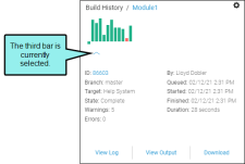
For each bar, you can view the following details:
- ID The identification number of the build.
- Branch The name of the branch for the build.
- Target The name of the target for the build.
- State The state of the build (e.g., completed, failed, canceled).
- Warnings The number of warnings found while building the project.
- Errors The number of errors found while building the project, which prevent the build from completing.
- By The person who initiated the build.
- Queued The date and time that the build was queued.
- Started The date and time that the build started.
- Finished The date and time that the build finished.
- Duration The length of time it took to complete the build.
You can also use the buttons at the bottom of the widget:
- View Log Opens the log for the selected build so that you can see information about warnings or errors.
- View Target Opens the output for the selected build.
- Download Lets you download the output files for the selected build.
Note Data will not display in this widget until you select a project and target, and until you generate the target in Central.
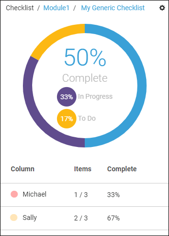
Checklist
The Checklist widget displays a progress summary for a checklist. In the upper-right corner, click
to select a project and checklist for the widget. 
Note Data will not display in this widget until you select a project and checklist.
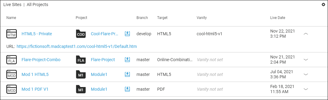
Live Sites
The Live Sites widget shows all of the sites that are currently set as “live.” In the upper-right corner, you can click
to filter the widget by project and the most recent number of sites to display. You can also click a row to expand that site to see the URL.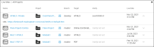
In this widget, you can view or do the following:
- Name The name of the site. Click the name to open the Sites page.
- Project The name of the project.
- [Download Icon] Clicking the icon downloads the output to your computer. Multi-file outputs are downloaded as a ZIP file.
- Branch The name of the branch built for the live site.
- Target The name of the target, which you can click to open the Builds page.
- Vanity The vanity for the live site (if one has been set).
- Live Date The date the site was set as “live.”
Note Data will not display in this widget until you set a site to "live."
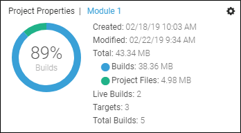
Project Properties
The Project Properties widget shows important information about the selected project. In the upper-right corner, click
to select a project. 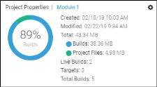
In this widget, you can view the following:
- Created The date the project was created (i.e., added to Central)
- Modified The date the project was last modified (i.e., changes were uploaded to Central, or changes made in Central)
- Total The total size of all the source files and all builds
- Builds The size of the output files
- Project Files The size of the source files of the project (Content and Project Folders)
- Live Builds The number of sites set to "live" for this project
- Total Builds The total number of builds in this project
Note Data will not display in this widget until you select a project.
Reports
The Report widgets are small tiles, each representing a different report. The number on each widget represents the quantity of issues found in the latest scan for that report. You can click the number and the Reports page will open with that report automatically selected.
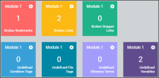
The following types of reports can be included in widgets:
- Broken Bookmarks These are links to bookmarks that are broken. In Flare, you need to fix the issue (e.g., remove or replace the bookmark link).
- Broken Links These are links—such as cross-references—that are broken. In Flare, you need to fix the issue (e.g., remove or replace the link).
-
Broken Snippet Links These are links to snippets that are broken. In Flare, you need to fix the issue (e.g., remove or replace the snippet).
-
Undefined Condition Tags These are conditions that have been applied in the project, but the name or location of those conditions cannot be found. This might occur, for example, if you have applied a condition in a topic and then later change the name of the tag or condition tag set. The old tag or set name is still used at the location where it was previously applied in the topic. In Flare, you need to fix the issue (e.g., rename the condition tag or set, remove the tag where it was applied).
- Undefined File Tags These are file tags that have been applied in the project, but the name or location of those file tags cannot be found. This might occur, for example, if you have associated a file tag with a topic and then later change the name of the tag or file tag set. The old tag or set name is still used for the topic. In Flare, you need to fix the issue (e.g., rename the file tag or set, remove the tag where it was applied).
- Undefined Glossary Term Links These are glossary term links in your content that are broken. This might occur, for example, if you have created a new term in a glossary and then inserted that term into a topic as a glossary term link. Later, you remove that term from the glossary. You now have a glossary term link in a topic, but the term no longer exists in the glossary. In Flare, you need to either remove the glossary term link from the content, or you need to add the term to the glossary again.
- Undefined Variables These are variables that have been inserted in the project, but the name or location of those variables cannot be found. This might occur, for example, if you have inserted a variable in a topic and then later change the name of the variable or variable set. The old variable or set name is still used at the location where it was previously inserted in the topic. In Flare, you need to fix the issue (e.g., rename the variable or set, remove the variable where it was applied).
When you add a new Reports widget to a dashboard, it is initially empty. You need to select a project to populate it. To do this, click
in the upper-right corner and a project and report.However, it is recommended that you open the Reports page and add widgets from there instead. The reason for this is that you can select multiple reports (rather than one at a time), and you can add them to both the Home and Project dashboard simultaneously.
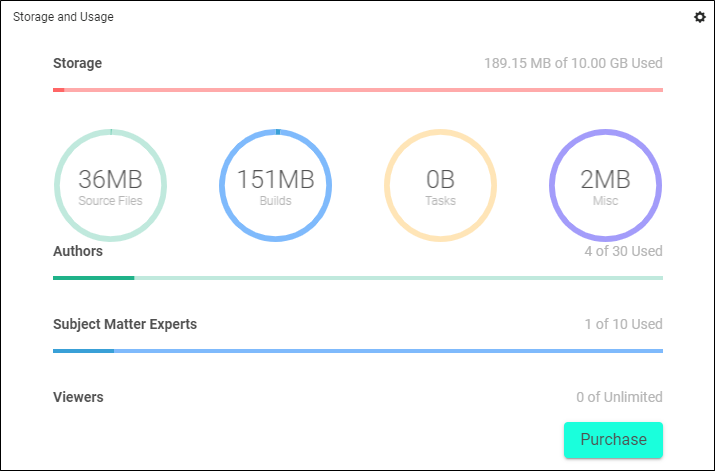
Storage and Usage
The Storage and Usage widget shows important information about the MadCap Central license. This widget is visible to all users, but buying additional seats or space requires the “Purchasing” permission.

In this widget, you can view or do the following, depending on your permissions:
-
Storage The amount of storage space used and the amount allowed.
Note If you are working in trial mode, you are granted an unlimited amount of storage space for that period. When you purchase the license, the amount of space entered must be at least as much as the amount you’re already using in trial mode. If you do not want to purchase that much space, you must first clean up your existing space (e.g., delete builds, projects, or other data taking up unnecessary space) before continuing with the purchase.
-
Authors, Subject Matter Experts, and Viewers The number of users currently in the system and the number of users allowed. There is a unique bar for each type of user.
Note If you are working in trial mode, you are granted an unlimited number of seats for that period. When you purchase the license, your number of seats you enter must be at least as high as the number you already added to the license in trial mode. If you do not want to purchase that many seats, you must first delete some users from the license before continuing with the purchase.
- Purchase Click this button if you wish to purchase Central storage space or seats.
Note This widget is only available on the Home page.
Task Calendar
The Task Calendar widget shows tasks that are due in a given month. In the upper-right corner, you can click
to filter the widget by project, user, and priority. 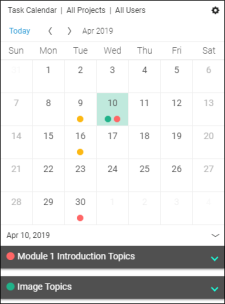
In this widget, you can view the following:
- [Calendar] Colored circles indicate tasks that are due on that date. The color of each circle represents the priority of the task due (red=high, yellow=medium, green=low). Use the arrows on the header bar to navigate between months.
- [Tasks Cards] If you click on a day in the calendar that contains colored circles, the area below has cards for those tasks that are due. Initially, the task cards are collapsed, but you can expand them to see more information. And if you click the name of the task, you can edit it and see even more details.
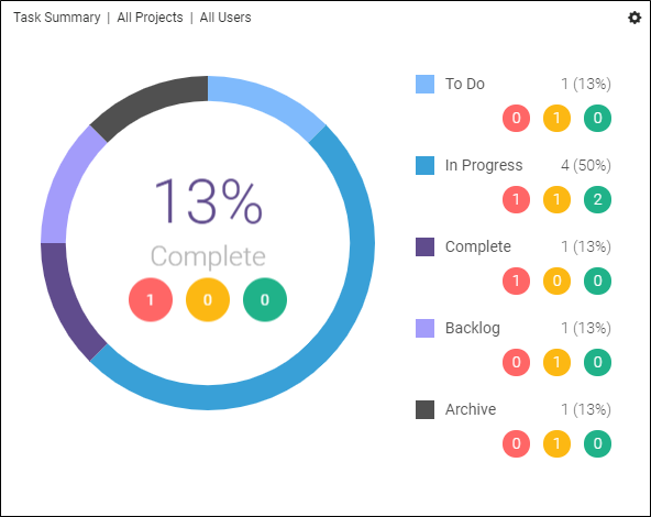
Task Summary
The Task Summary widget shows a doughnut chart that breaks down the percentage of tasks in each milestone and storage area (To Do, In Progress, Complete, Archive, Backlog). To the right of the doughnut chart, you can see a summary with the number of tasks at each priority level (High, Medium, Low). In the upper-right corner, you can click
to filter the widget by project and user. 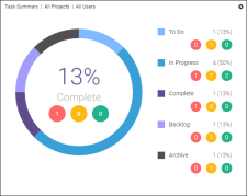
- Click Add. The widgets are added to the dashboard.